

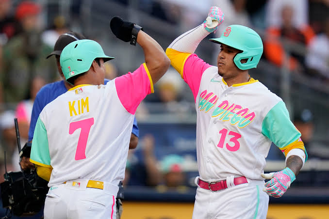
The San Diego Padres uniforms have always been more than simple baseball clothing. They reflect the team’s personality, the city’s culture, and the changing visual trends of Major League Baseball. Few teams have experimented with their identity as much as the Padres, moving through different color combinations, logos, fonts, and uniform styles before eventually embracing the brown-and-gold look that many fans now consider unmistakably San Diego.
In 2026, the uniform conversation is especially interesting because the Padres continue to balance their traditional identity with modern designs. The club’s classic brown-and-gold uniforms remain central to its visual identity, while the new City Connect collection introduces obsidian, bone, marigold, aqua, fireberry, and gold into a much more colorful design.
Whether you are a longtime baseball fan, a Padres supporter, or simply interested in sports fashion, looking at the evolution of the San Diego Padres uniforms gives you a fascinating glimpse into how a professional sports team can use clothing to tell its story.
The Origins of San Diego Padres Uniforms
The story of the San Diego Padres uniforms began when the franchise entered Major League Baseball in 1969. The original look immediately established brown and gold as important team colors. The early uniforms used relatively simple designs, with cream or tan bases, brown lettering, gold trim, and brown caps featuring the recognizable SD logo.
Interestingly, the reason behind the original use of brown is not quite as straightforward as many people assume. Because the team was called the Padres, it is easy to connect brown with the robes traditionally associated with Franciscan friars. However, historical research from the San Diego History Center indicates that the team’s original owner, C. Arnholt Smith, personally favored brown and used the color extensively in his other businesses.
The early uniforms established a visual identity that was unusual in professional baseball. Brown was not a common primary color among MLB teams, which helped the Padres stand apart. Over the following years, however, the organization experimented heavily with its appearance, sometimes moving far away from the original concept.
How the Padres Uniforms Changed Over the Decades
One of the most interesting things about the San Diego Padres uniforms is just how many times the team changed its visual identity. The Padres went through numerous redesigns involving brown, gold, orange, blue, white, and other combinations. The uniform history has been described as remarkably inconsistent, with major changes and smaller adjustments occurring repeatedly over the franchise’s first several decades.
During the 1970s, the Padres experimented with especially bold designs. At one point, the team wore predominantly gold uniforms, while other versions featured brown tops, gold lettering, and distinctive caps. The Swinging Friar also became an important part of the team’s visual identity, appearing on uniforms at various points throughout the franchise’s history.
The 1980s and 1990s brought further changes. Gold evolved toward orange, and eventually the Padres adopted combinations involving navy blue, orange, and white. For a period, those colors became more closely associated with the organization than the original brown-and-gold palette. This era remains memorable for fans, particularly because several iconic Padres players wore those uniforms.
Why Brown and Gold Became So Important
Although the Padres spent years experimenting with their appearance, brown and gold eventually became deeply connected to the team’s identity. The return of brown was driven partly by fan demand, with the “Bring Back the Brown” movement becoming an important part of the conversation surrounding the team’s visual direction.
The organization officially unveiled a new brown-and-gold uniform collection in November 2020. The primary home uniform featured brown lettering with gold outlining, brown-and-gold piping, and the Swinging Friar on the sleeve. The road design used brown with gold “SAN DIEGO” lettering, while another alternate incorporated a lighter sand-brown appearance.
That decision was significant because it gave the Padres something many sports teams struggle to maintain: a distinctive identity. Brown and gold immediately separate San Diego from teams that rely on more conventional combinations such as navy, red, royal blue, or black. The colors also connect the modern team with its earliest MLB history.
The Modern Classic Padres Look
Today’s traditional San Diego Padres uniforms are a good example of how a retro-inspired design can still feel contemporary. The home look, with brown pinstripes and gold-trimmed lettering, has a classic baseball appearance without looking outdated. It combines familiar visual elements with modern athletic construction.
The brown-and-gold combination is particularly effective because the two colors complement each other naturally. Brown provides the strong base, while gold adds contrast and gives the lettering and trim additional definition. The result is a uniform that looks recognizable from a distance and distinctive enough to work well in photographs, broadcasts, and merchandise.
The Swinging Friar also remains an important part of the identity. Instead of relying entirely on a modernized wordmark, the Padres can use a historic character to connect today’s players with earlier generations. That balance between history and modern presentation is one reason the Padres’ traditional uniforms have developed such a strong following.
The Evolution of Padres City Connect Uniforms
The Padres entered MLB’s City Connect program in 2022, introducing a colorful design inspired by San Diego and the surrounding region. The original City Connect uniforms drew from the coastline, sunsets, Southern California lifestyle, and the shared culture of the San Diego-Baja California region.
City Connect uniforms are different from standard team uniforms because they give clubs an opportunity to tell a more localized story. Instead of simply displaying a team’s established colors, these designs can incorporate cultural references, regional symbols, and unusual color combinations.
For San Diego, that approach made sense. The city’s coastal environment, border-city identity, multicultural communities, and relationship with Mexico provide plenty of inspiration. The Padres used those ideas to create something that looked completely different from their traditional brown-and-gold uniforms while still feeling connected to the region.
The 2026 Padres City Connect Uniform
The newest development in the San Diego Padres uniforms story arrived in 2026 with the introduction of City Connect 2.0. MLB and the Padres unveiled the new design in April 2026, creating a uniform that takes the team’s connection to San Diego’s regional culture in a more colorful direction.
The 2026 design uses an obsidian jersey with a colorful wordmark, bone-colored pants, and a distinctive cap. The official palette includes bone, obsidian, marigold, aqua, fireberry, and Padres gold. The sleeve design includes marigold detailing, while the uniform also features a La Catrina patch connected with Día de los Muertos traditions.
The Padres have said the design celebrates their binational fanbase and draws inspiration from the region’s landscape, coastline, sunsets, culture, history, and traditions. The team announced that the new City Connect uniforms would be worn for Friday home games, beginning with their April 10 debut against the Colorado Rockies.
The Cultural Meaning Behind the 2026 Design
What makes the latest San Diego Padres uniforms particularly interesting is the amount of cultural symbolism incorporated into the design. La Catrina, marigolds, colorful decorative elements, and the coastal-inspired color palette give the uniform a visual language that goes beyond conventional baseball branding.
San Diego State University researchers have also examined cultural references within the new uniform, including the use of La Catrina, marigold imagery, and papel picado-inspired details. These elements connect the design with Mexican traditions and broader cultural histories rather than functioning as simple decorative graphics.
That cultural approach helps explain why the City Connect uniform looks so different from the Padres’ traditional brown-and-gold set. The purpose is not necessarily to replace the classic identity. Instead, it creates another visual expression of what San Diego represents, giving fans a uniform that feels strongly connected to the place itself.
What Makes Padres Uniforms Stand Out
There are plenty of attractive uniforms in Major League Baseball, but the San Diego Padres uniforms have a quality that makes them particularly memorable: they are willing to be different. Brown is already unusual in baseball, and the team’s willingness to combine historical designs with modern concepts has created a wide range of memorable looks.
The traditional brown-and-gold uniforms are probably the clearest example. They are instantly associated with the Padres and have a strong vintage character without requiring excessive decoration. Meanwhile, the City Connect uniforms take the opposite approach by embracing bright colors, cultural details, and a more artistic presentation.
That contrast gives the Padres a surprisingly versatile visual identity. Fans can choose a classic brown jersey when they want a traditional baseball look or a City Connect piece when they want something more contemporary and colorful.
Choosing a Padres Uniform as a Fan
For fans deciding which San Diego Padres uniforms to buy, the best choice often depends on personal style. The classic brown-and-gold jersey is arguably the safest option because it represents the team’s core identity and works well as an everyday sports shirt.
A City Connect jersey, on the other hand, offers something more distinctive. The 2026 version is especially colorful and incorporates design elements that make it immediately recognizable. It can work as both baseball merchandise and a casual fashion piece.
Fans who appreciate baseball history may also prefer throwback-inspired designs. Older Padres uniforms represent different periods of the franchise and can be especially appealing when connected to legendary players or memorable seasons. The team’s long history provides plenty of options for collectors who enjoy uniforms as pieces of sports history.
The Future of San Diego Padres Uniforms
The future of the San Diego Padres uniforms will likely involve continuing to balance tradition with experimentation. Brown and gold have become too important to the team’s identity to disappear easily, but modern baseball also gives clubs more opportunities to explore alternative uniforms.
City Connect has demonstrated how a team can tell a different story without abandoning its main identity. The Padres can continue using their classic uniforms as the foundation while developing special designs that highlight San Diego’s communities, culture, geography, and history.
That flexibility is valuable. A uniform should not simply look good; it should communicate something about the team wearing it. The Padres have increasingly found ways to make their uniforms communicate both where the franchise came from and what San Diego represents today.
Final Thoughts on San Diego Padres Uniforms
The history of the San Diego Padres uniforms is essentially a history of experimentation, nostalgia, and identity. From the original brown-and-gold designs to the colorful uniforms of later decades and the return of brown in the modern era, the Padres have never been afraid to rethink their appearance.
The 2026 City Connect uniform adds another chapter to that story. Its obsidian base, bright colors, cultural references, and La Catrina imagery provide a completely different look while celebrating the region’s character.
Ultimately, that variety is what makes Padres uniforms so interesting. The traditional brown-and-gold look represents the club’s roots, while newer designs show how the organization continues to interpret San Diego for a modern audience. Whether you prefer the classic pinstripes, the bold brown alternates, vintage styles, or the latest City Connect collection, there is no shortage of history and personality woven into the team’s uniforms.
You May Also Raed: Englishtistic